💤 WHOOP Dashboard
A personal health command center built on top of the WHOOP API, adding the sports-science analytics (training load, HRV readiness, sleep debt, correlation analysis) that the WHOOP app itself doesn't show.
WHOOP shows me today's recovery score, but never answered what I actually cared about: am I training smart, or quietly building up an injury? A single number does not show whether this week's load is creeping up too fast, or if last night's bad sleep is connected to tomorrow's performance. I was flying blind on the trends that matter most.
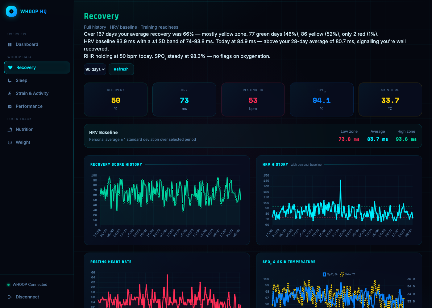
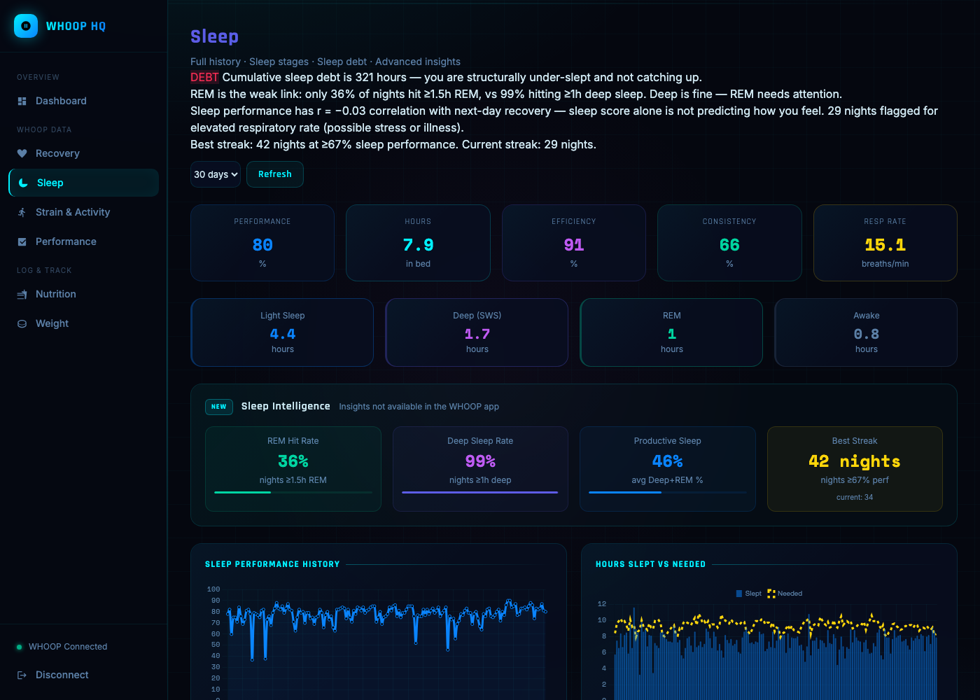
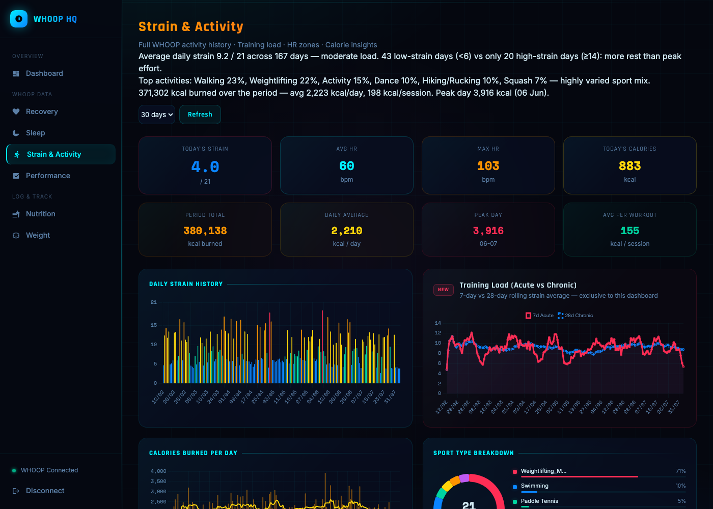
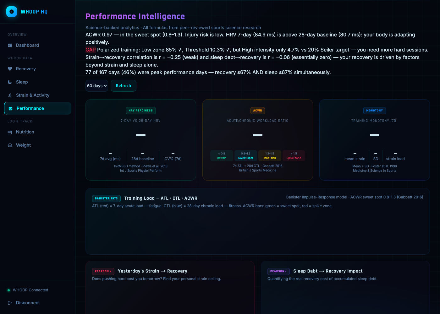
So I built a dashboard on top of my own WHOOP data that answers the bigger questions. It calculates the same metrics coaches actually use: acute-to-chronic training load ratio (7 days versus 28, the method used to flag injury risk in elite athletes), HRV measured against my own baseline instead of a generic range, and the real statistical correlation between my sleep debt and next-day recovery.
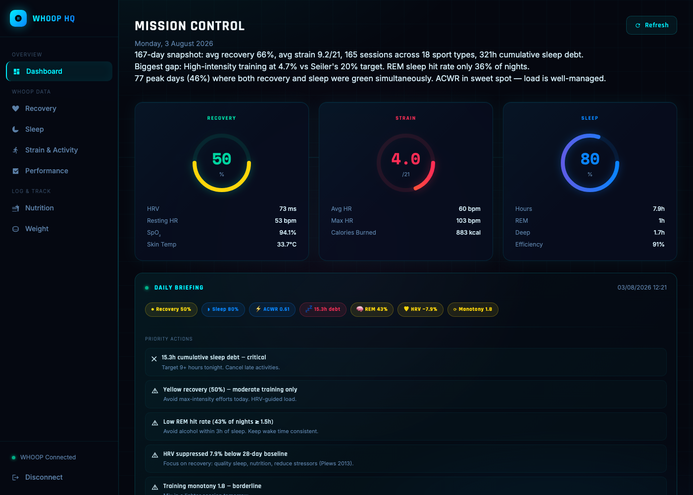
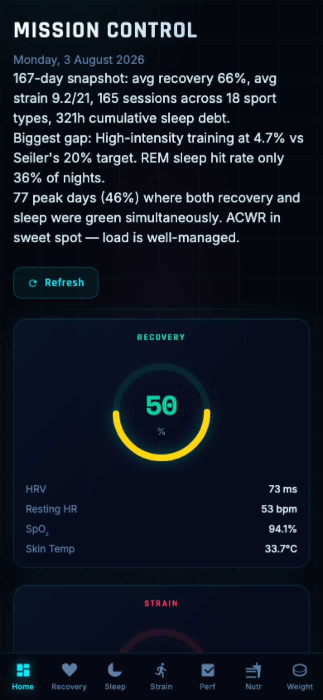
Now I open one dashboard and see the full picture: a daily briefing on what to prioritise, full history for Recovery, Sleep, Strain, and Performance, and a page showing exactly which sports-science research (Plews 2013, Gabbett 2016, Banister 1975) each metric is built on. Installed on my phone, so "push hard or back off" is one tap away instead of a guess.
Screenshots
All screenshots below are of the live dashboard rendering my own 167-day WHOOP history, not sample data.